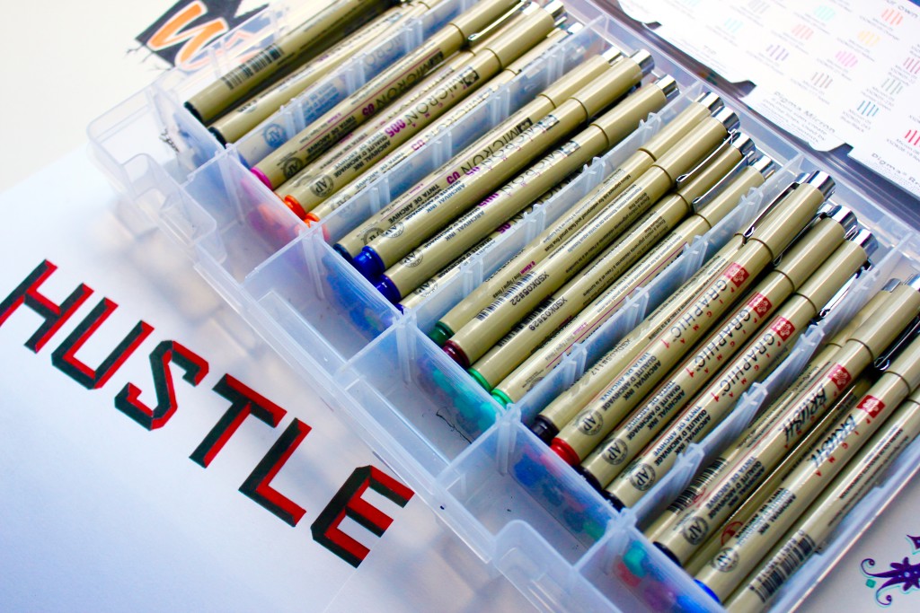
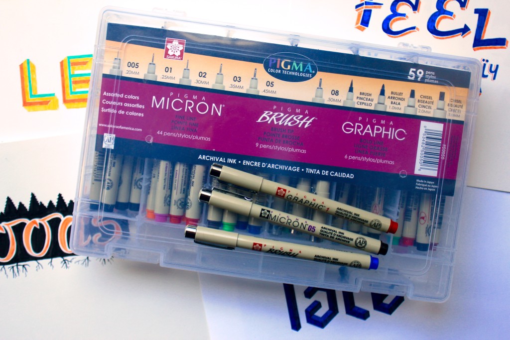
I was so excited when I found out that Sakura makes a huge kit containing 59 different Pigma® pens! I’ve been using black Pigma® Micron® pens almost exclusively since I began handlettering, but this kit contains so much more. Not only does it have the black Micron® pens I’ve come to love, in every nib size available, but it also has every color of Micron® they currently manufacture. The numbers on the side of the pen correspond with the nib size, so you can achieve precisely the effect you want. It even has a handy chart to help you keep track of your new stash.
Every pen in this kit contains Sakura’s unrivaled Pigma® ink, which is archival quality and resists smearing and bleeding. This kit also contains the thicker Graphic 1 pens, which have bullet style nibs, as well as Graphic 2 and 3 pens, which feature a chisel nib. Plus, it has 9 Brush pens!
Try These Handlettering Tips & Techniques:
1
Try adding shadows in front of your word to give the illusion of height.
2
Stippling adds texture to a piece. Stipple heavily in shadowed areas, and sparingly in areas the light would shine.
3
Pigma ink pairs wonderfully with watercolor paint. It won’t run!
4
Use brush pens for quick lettering projects.
5
Try weighting only one side of your letters for an eclectic vibe.
6
Most of my hand lettered pieces start as sketches drawn with a Sumo Grip® pencil. Create faux calligraphy by thickening the downstrokes on your letters.
7
Make a distressed finish by leaving white streaks on your design.
8
Utilize tails or ligatures as flourishes to enhance your design.
9
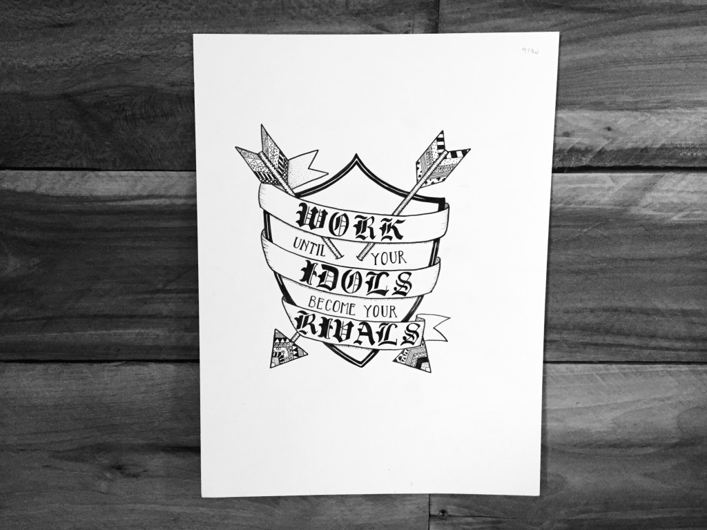
Add a frame to make your piece pop. Play around with patterns.
10
Draw “invisible” letters by inking only the shadowed areas.
11
Enhance brush lettering by drawing inline with a second color.
12
Utilize guidelines to space your letters. Pair contrasting letter styles for visual interest.
13
Try coloring in the letters with stripes, then erasing the outline.
14
Banners can be interesting elements that draw the eye.
15
Play around with various caps and serifs on your letters. Try slab serifs, ball serifs, or splayed serifs.
16
Pair inked letters with pencil shadows for extra dimension.
17
Draw a frame and fit your letters inside, then erase the frame.
18
Combine your lettering with an illustration for extra impact.
19
Change the angle for drawing letters, to make them appear to be lying down.
20
Alternately, you can curve your letters and add shading to give them the illusion of lifting off the paper.
21
Add pencil scribbles for a chaotic mood.
22
Try drawing extra thin letters with multiple layers. Add a different color to each layer.
23
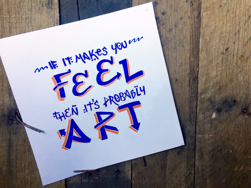
Take a cue from graffiti art and draw 3-D letters.
24
Take a break from guidelines and purposefully create letters of different sizes. Vary the direction of the shadows on each letter for a crazy, funky piece.
25
Use a transparent ruler to draw faceted type. Fill in the facets with contrasting colors.
26
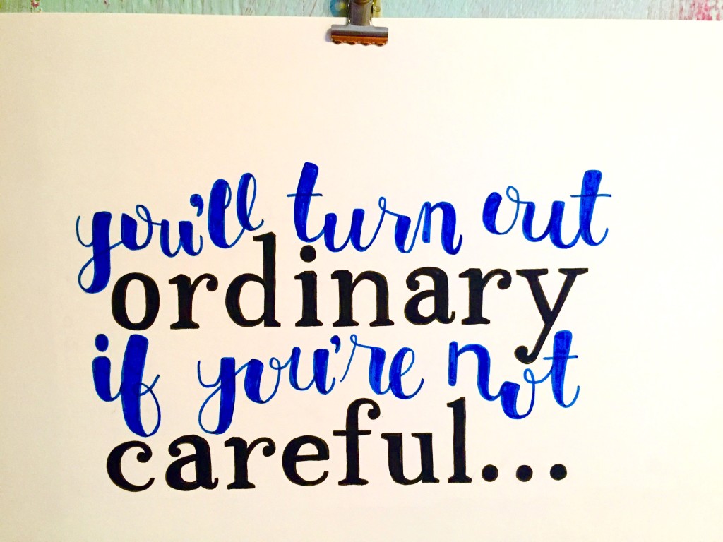
Try combining a free-spirited script with tidy serifed text.
27
Push yourself by drawing letters that look like folded paper. Add stippled shadows, then shade with pencil.
28
Try drawing text that is cube-based. I used three different shades of blue to color the facets on this piece.
29
Have fun creating letters comprised of shapes and patterns.
30
Draw elegant letters with curls, spurs, and inline shapes

 Finished?
Hi,
I was just wondering where did you got the 59 piece micron pen case?
you do lovely work
thanks in advance
You can purchase it on Amazon :)
You are so talented! I would love to be able to do lettering like you and to be as creative. Thank you for your informative videos.