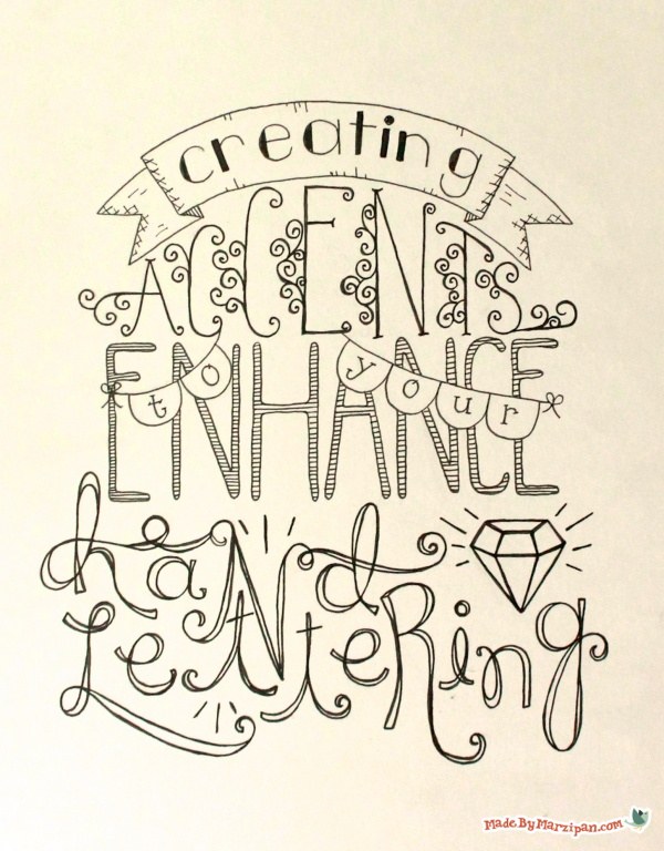
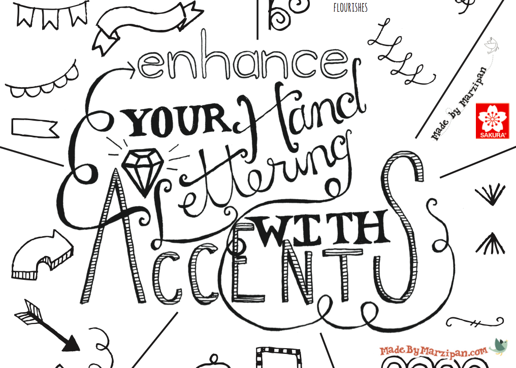
This tutorial will show you some ideas for basic accents that can enhance your hand-lettered work. Plus: free Hand Lettering Accents printable!
Click here for the Intro to Hand Lettering tutorial.
When I create a hand lettering project, I always start by sketching with a Sumo Grip® mechanical pencil. I have a clear ruler and a large eraser on hand. However, since I’m just doodling today and not working on a piece of art, I’m going straight to a Pigma® Micron® pen. These come in a variety of colors and nib sizes.
First we’ll start with some banners. I like using these to write the name of the person I’m quoting.
To draw a basic banner, draw a horizontal line, with an identical line below it. Connect the lines with a sideways V on each end. Variations include a curved banner, or a flag.
Dimensional banners start out the same way. Connect the two lines with a straight vertical line. Now we’ll draw the tail segments on the sides. Go about ⅓ of the way down the side of the banner, then draw a curved horizontal line. Draw the sideways V, then the bottom line. The bottom line is placed below the banner. You want to try to keep both the banner and the tail segments the same width. Repeat on the other side. Join the bottom corner of the banner with the inside corner of the tail piece, at an angle.
Buntings are easy to create. They’re great for adding small words like “AND” or “THE.” Draw a curved horizontal line, then add triangles, flags, or half-circles.
Flourishes add grace and charm to hand-lettering. This first style consists of curls. Try writing the letter C, then keep spiraling inward at the top. Add curls in the opposite direction. Try elongating a curl, and adding diagonal lines in the center. Curls can also go vertically.
This next style is based on a capital, cursive L. Write a cursive L, then start the next L at the end of the first. Do not lift your pen. You could also align the L’s vertically to create a flourish border.
Simple loops can draw the eye to a short word.
Another flourish style is created by writing a lower-case cursive S. Write a series of S’s, starting small, then gradually getting larger, with the largest S at center. Gradually decrease the size of the S’s on the other side.
Dividers are useful because they cause the eye to pause briefly when reading hand lettering. Simple lines, dots, and scallops are an efficient use of space.
Frames add fun to a hand lettering design. Tags, looped circles, badges… really, any shape you imagine can become a frame.
Arrows say, “look here, this is important!” You can draw fat, dimensional arrows, loopy arrows, line arrows, or dotted arrows. You can draw an arrow to fit in any space.
I hope these doodles have given you some inspiration for your own hand lettering designs. Check out Intro to Hand Lettering here. Want to share your hand lettering? Upload to the “Made By You” below!


 Finished?
Very informative! Thank you
wewe
Awesome!
Love it I just cant get it for some reason
Hi Marzipan,
This was the very first video I watch: I still go to watch it again to improve myself !
I hope there will be others like those…
XOXO, Lilou from France ^_^
BTW thanks for the chance to win.
I love your tutorials. The ones on hand lettering are my favorites on youtube.
Wow! I love your lettering! Keep doing the tutorials!
Wonderful!
great lettering tutorials and the pdfs are really helpful too. thanks!
This is the first site I found on hand lettering, Thank You – AWESOME!!!
Wow! What a great tutorial! So well done! Thank you
AwEsOmE. Love it I’ve wanted to do this for years. Thank you so much.
{ } ¥¥¥¥¥¥¥¥¥ XxxxxxxxxX @@@@@@@@@@
You’re welcome!
I think your tutorials are absolutely the best! I have pretty sloppy handwriting…not a ton a patience..and have trouble with everything smearing because I’m left handed. I am learning patience but would love some advice on the most smear proof pens to use. Thanks!!
I always use Microns.
Hello,
I saw your tutorial on how to bind a quilt and was wondering how to subscribe to you website?
This was a really great video. I have watched lots and printed lots, but you seemed to sum it up beautifully in your video. I am going to be teaching a class on Scripture Study at church and one of my main messages is keeping a scripture journal – and I want to give the ladies a handout to show them the fun they can have while writing in their journals. The page that you wrote out in your VIDEO with the banners, frames, arrows etc. is really exactly what I would like to give them. Would you be willing to put that page up for a free printable? If I was sure to have your website/logo on the page could I use it to print for that one class I will teach?
thank you