For the past year, I’ve been studying sign painting. I figured that since I’m good at hand lettering, I’d be good at this too. I soon discovered that sign painting presents its own challenges. I’ve learned helpful tips and techniques that I’d like to share with you.
How to:
made with
1
I painted my wood surface yesterday, so it’s dry and ready to letter on. (I’m waiting to paint the sides of the box, since I’m messy and sometimes get fingerprints there. I’ll paint that part last.)
2
I like to sketch my design on paper first. Many sign painters just go for it and draw the design directly on the wood surface, often with a specialty pencil like this one. But since I do a lot of erasing, I’m more comfortable starting on paper.
3
I’m spacing my letters widely so that I can add sides to give them dimension. I might add a shadow later, but I usually like to see how my design looks painted before I decide.
4
When it comes to adding your design to your painting surface, you have a couple of options. You can hand letter it again using a pencil. For dark colors, or glass, you can use a white All pencil. For large designs, you can look up how to use a pounce pad and wheel. Or for smaller designs, you can use transfer paper, which creates an erasable line when traced. This specialty paper is often used for quilting and sewing, but it works nicely for sign painting too.
5
Cut out a piece of transfer paper the same size as your design, and lay face down against the wood. Place your design text-side up on top, and lightly tape in place. Trace firmly with a pencil.
6
Let’s talk about paintbrushes. I wasted a frustrating amount of time experimenting with the wrong brushes, and I was shocked at how my painting improved once I purchased the right ones. You’ll want to use a liner brush, which has long and flexible bristles that taper to a point when wet. I bought these Kafka script liners from DickBlick and they’re incredible. A smaller brush is more versatile, so I recommend choosing a size 1 or 2.
7
When it comes to paint, I like 1-Shot enamel paint the best. Again, I wasted a lot of time playing around with acrylics and even other brands of enamel paint. 1-Shot will give you the best coverage, it’s super glossy, and it’s weather resistant.
8
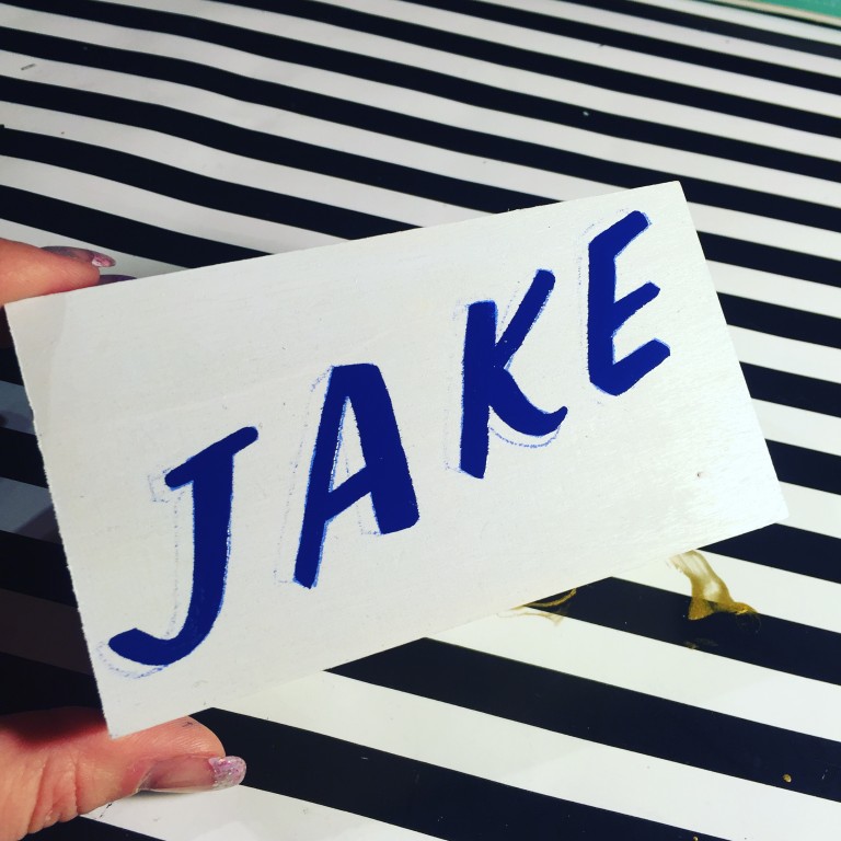
Okay, we’re ready to paint! When possible, you’ll want to make long strokes rather than short dabs. This will give you a smoother, steadier line. I’m using a size 1 brush, choosing to make two stroke widths to fill my letter. I could use a bigger brush and do it in a single stroke, but honestly, my hand isn’t that steady. When I do two strokes, it allows me to be more precise and adjust for any wobble.
9
I find it helpful to start my next stroke by overlapping my previous stroke. This helps me find the correct line placement and continue it smoothly.
10
Don’t press to hard against the wood; you want the brush to glide lightly. If you apply to much pressure, your line will widen and it will be difficult to keep your stroke even. When you reach the end of the stroke, slowly and gently lift the brush as you pull towards you, for a nice tapered finish. This is especially important as you’re working near corners.
11
It’s important to properly clean your brush before moving on to the next color. I like to use turpenoid because it’s low odor, but mineral spirits work too. It’s a good idea to wait until your first color is dry so that you don’t accidentally touch the wet paint.
12
Next I’ll paint the sides of the letters. I’m going to use two different shades. I’m putting an X on the facets that will be painted the darkest color. These are the ones on the bottom or the underside of the letter.
13
First I’m painting the areas without the X’s. In other words, the facets on the right sides of the letterform. I’m using paint straight from the can.
14
For the next color, I’m adding a single drop of black paint to the first color. The black is highly pigmented so a little goes a long way. You want this color to be a slightly darker shade than the first.
15
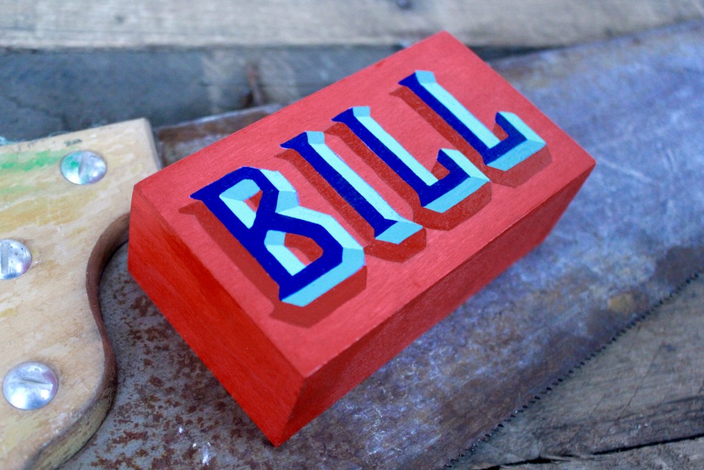
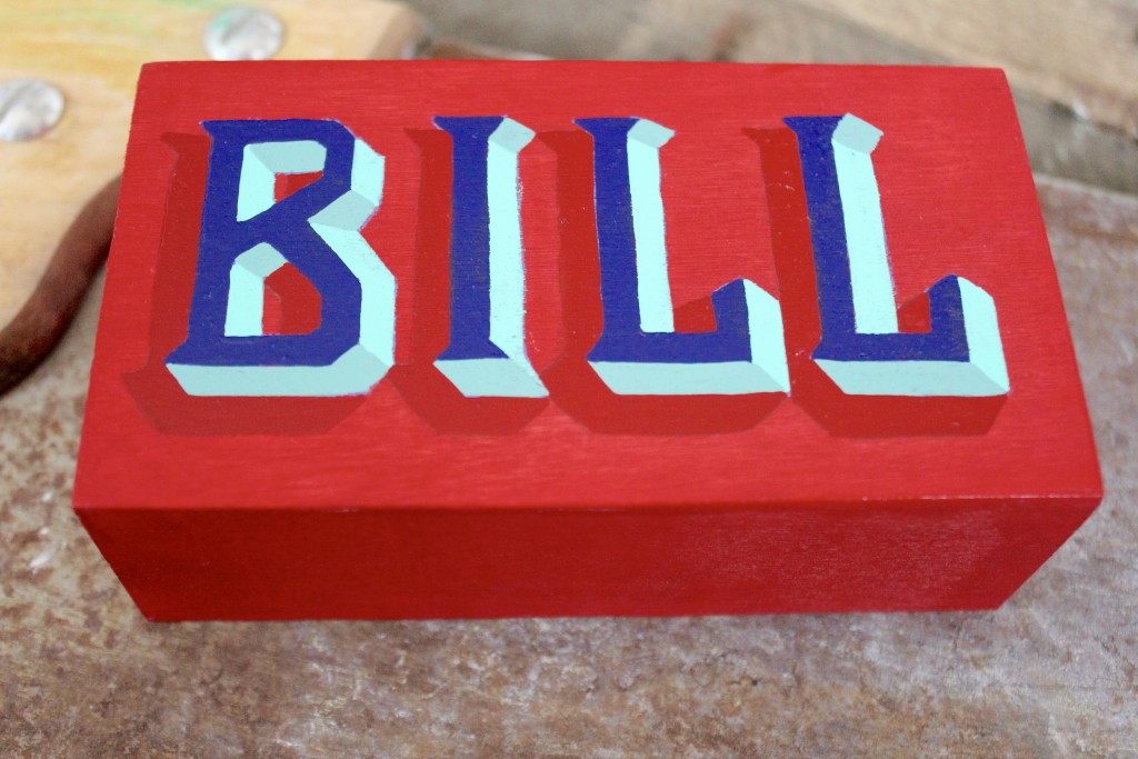
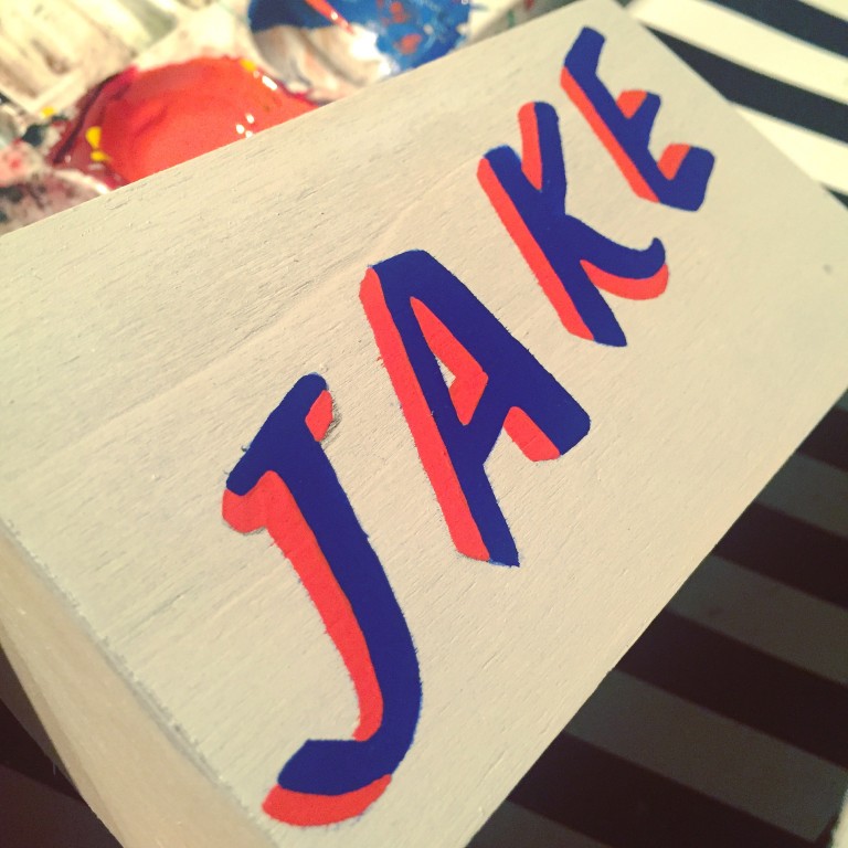
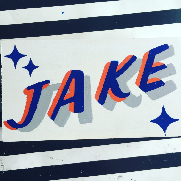
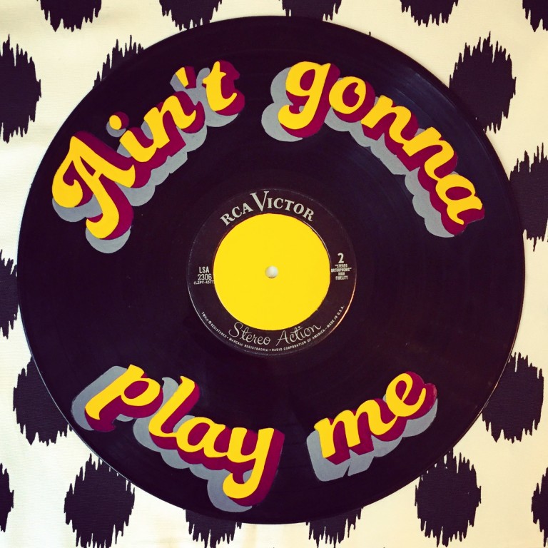
Now that I’ve painted the design I sketched, I can decide whether it needs something else, like a border or a drop shadow or a cast shadow. I think I’ll add a shadow on the left sides of the letter. To do this, imagine you’re sketching the full letter a second time, just placed slightly lower. Take into account the entire shape of the letter, including the sides, as you re-draw it.
16
I like to make my shadow paint the same color as my background paint, with a single drop of black added.
17
Finally, paint the sides of my box. Let the paint cure for a day before you erase your tracing and pencil marks.
See more lettering in my gallery. And I have to give a shoutout to @SignsByBob on Instagram, for showing me the ropes!
Made By Marzipan may have received product or payment for this post. Posts may contain affiliate links. Disclosed in accordance with the Federal Trade Commission's 16 CFR, Part 255.

 Finished?